Sunday, 28 March 2021

Hull Streetlife Museum of Transport

 28/03/21 - Week 25


This week, we had a tour of the Hull Streetlife Museum of Transport. I found this tour rather interesting and created 4 preparatory sketches of some of the vehicles, I think some of these ended up being more sucessful than the final piece but I am not too sure as to why. My favourite is the 1st or 3rd one as I feel like the shading, although rough, is accurate. The perspectie in some places is still off on these though I feel as though the sketchy aspect of them makes that ignorable.


 I chose this vehicle as my final piece as at the time I liked that sketch the most though I most likely would have chosen a different one if I had to do this task again. I tried quite hard to get the perspective somewhat correct but I recognised I liked the sketchy style I was creating on the sketches and I wanted to still try to replicate that in the final piece. This was definitely a mistake as there is not a lot of perspective issues in my final piece which don't look as charming - most of the issues here like in the wheels and the interior of the vehicle. I dont think there is anything glaringly wrong with the perspective here, only small things, but I think I think that as I am not used to drawing vehicles and cannot really recognise these things as easily.


As I got into the shading of this piece I did start to encounter more issues, I was really struggling with the perspective and also was debating adding the text on. I ended up doing so but I think that in the end this makes the piece look really childish as I am not one who has a hand for caligraphy and that really shows. I also struggled with the contrast of the piece too and felt that I wasn't really getting it. The reflections on the glass did not help this as this really confused me with the contrast in these areas and i think it has resulted in the windows looking very strange. The lighting on this vehicle I thought was good, but I think it needed more contrast in general to be able to get more detail in the light and in the end would have produced a more detailed piece.
Something else I was struggling with was the curvature of the tour camera, I am not sure if this vehicle had a slight curve to it or it was actually the camera, but I included this anyway, though again, I don't think this was the right decision.


To really try to improve on the contrast of this vehicle, I decided to bring in some charcoal. This definitely helped to make this piece look a lot better in terms of contrast and I managed to get more of the effect I wanted for the tires and the shadows to blend together to replicate the same darkness of the image. I didn't manage to completely pull this off but the charcoal did help me here.
In the end though, I don't think this piece was very successful at all. One of the only parts I really like is the bumper on the wheel as I feel the shading here looks good, other than that, the multiple perspective and un-straight lines in this piece really ruins it and it really does look a little childish. I play this down to my inexperience in drawing vehicles though some of the mistakes on this piece are quite rookie and if I had the time I would probably redo the whole thing and perhaps choose a different vehicle from the tour.
Overall, this piece was very challenging though it will help me lots with the next piece as I now know what not and what to do to create a more successful outcome.


Saturday, 27 March 2021

Finishing Modelling

 27/03/21 - Week 25

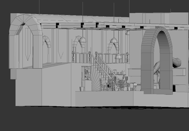
The past couple of weeks, I have been working on finishing all the modelling from the initial blockout. This is where I currently am. I still have to put a couple things into zbrush to create some detail this is mainly the tree root, the stone arches and I would also like to implement a helmet that I would need to sculpt. I have taken all of this into unreal though I have not yet put in any lighting.
I am pretty happy with how this looks, I wanted to add quite a bit of detail to the kitchen area and I mainly have done this by filling it up with plates, ingredients and glasses. Hopefully I will still have time to texture all of this and make it look how I want it to. I am happy that the areas look a lot like how I initially wanted them to in my sketches and I think it will create a successful and interesting set of rooms for the group project.

I didn't run into too many issues but I think I definitely was very slow with modelling this, I did things like not name things as I went along or unwrap when I was modelling. I was worried I was going to change things but in the end I didn't change too much once I had placed it in so having to deal with the amount of duplicated things and renaming everything just slowed me down a lot. I will definitely take this into consideration next time I work on a project and hopefully it will allow me to speed up.


Friday, 26 March 2021

Thumbnails

 26/03/21 - Week 25

From the sketches I had last week, I created a base with all the parts I liked the most and created some variations of it in thumbnail form. I wanted to try out some of the ideas I had from those sketches too and combine them with this base and I think I had some pretty good results. I think these are some of the more sucessful thumbnails I have created, I tried to stick to just one tone and not always change too much. This really helped me to create some solid bases for a design rather than trying to focus on smaller details or always having to come up with a very different design. 
From these I think my favourites are 8, 9 and 15. I think these include a lot of the things I liked from the moodboards and also the sketches I made before. I also like how the silhouettes work here and I think with some adjustment to them they could be quite strong ideas.


Sunday, 21 March 2021

Clothed Figure

 21/03/21 - Week 24

This week, I created a clothed full body piece. I chose to do this in coloured pencil as though I do really like using chalks and charcoal I felt that I wouldn't be able to get the nuance I wanted for this piece if I were to use a heavy handed medium. 


I first started out with the sketch, This was very rough and there are definitely a lot of errors here. I was counting on trying to work in a lot of the detail with the pencil here and not worrying as much with the initial sketch itself. This was an interesting method and I do think I prefer having a better sketched out image in the first place to work into after experimenting with this. As you can see, there are a lot of proportional issues here at the beginning that I have left for myself to figure out.


Starting to add some colour, I also began to fix a lot of the proportional issues and also add detail to make it less rough. Looking back at this piece I still see some issues such as the left leg, I have always struggled with legs and I think this one suffered the most. I also feel that the shoulders are not wide enough for the proportion of the head. I was attempting to get across the slumped nature of the model but the perspective does not read.
I chose a toned down colour palette here as I wanted to try to create realistic looking clothing folds and most of these are created with the use of colour variation, especially on this piece. The white top allows for a lot of different colours to appear within the folds of the clothing which I find very interesting. The original image also had a colder colour palette so I have quite a few cool tones here as the cold surrounding reflects onto the white top and skin in particular.


As I finished off the piece, I emphasised some of the line weight and this really helped for the portrail of the feet in particular. I usually struggle with the feet but I am happy with the way I have conveyed them in this piece. I also fixed up the expression, tried to add some more contrast and deepen some colours which really helped to make some areas of this piece feel more finished and whole.
Though the white top was challenging to create the correct colour, I do not think it ended up being too bad. I am also happy with the clothing folds on this piece though there is still room for improvement on the realism factor in some senses.

Overall, I am happy with this piece though I do still see room for improvement, mainly in my own artistic intention for pieces like these. I should put more effort into thinking about contrast, colour palette and line weight rather than just going for the easiest or safest option. This would make my artwork more interesting and stylistic rather than just being a portrait or a study.
I think I was successful in portraying comprehendible anatomy and also accurate folds in the clothing, and though the colour isnt particularly experimental, I still like the way I have used it on this piece, especially for toning the top and skin tone to indicate shadow.


Friday, 19 March 2021

Blue Sky Sketching

 19/03/21 - Week 24

This week, I just wanted to get down some sketches from the ideas I had from my moodboards. I wanted to try to combine all of the different styles to try to create the sort of style I was thinking. This included some less humanoid shapes and some more exaggerated humanoid ones. There's definitely a lot of interesting ideas here and I really like some of the results such as the wings on 3 and the overall design of 6. I want to try to translate what I like here into thumbnails and hopefully create some more availability for variations.


Saturday, 13 March 2021

Combining black & colour media

 13/03/21 - Week 23

This week we were instructed to create some pieces in both charcoal and colour media. I chose the task that was two seperate pieces instead of the combination as I felt it would allow me to focus more on details which is hard with such a large material such as charcoal and chalk.

The first piece I created was the female figure. This is my favourite out of the two by far. I paid a lot of time into combining the colours of the chalk to create lots of different tone but still a realistic sense of lighting.
I went first in with the charcoal to get the figure right. I feel that charcoal is a very expressive medium and I enjoyed using it to get the model's curves right in this piece. I did struggle with some areas and getting things exact proportionally. This mainly occurred towards the legs and arms, which is something I struggle with in general. I don't think this necessarily takes away from the piece but I can still see the errors. I thought this angle in particular was very interesting for the arms and legs which is why I chose it in the first place, the leg ontop of the other produces some very interesting, soft and hard shapes which helped further my understanding of the muscles in this area. They also produced a lovely section of shade against the light which was fun to draw in.

In this piece, I decided I wanted to try to get rid of the black line of the charcoal as much as possible, on the outside I did this by creating a background with the charcoal itself, but on the inside I tried to blend it with my purple and blue to create shadows. I think this worked quite well and it helped with the softness of the piece which I really do like. The colours also played into this as blending these pastel colours together creates quite a light and airy feel to it. This is definitely emphasised by the dark background and allows the colours to stand out a little more.
My favourite thing about this piece is the way I tried to capture the colours of the shadow and light into the piece, I think I did this really well, though it is emphasised, and I love the effect this creates. Obviously, this piece is not without fault, I do recognise that the face is not brilliant and I really struggled with the use of the charcoal and chalk to create shading on the face and also the shape of the facial features. Overall, though I am quite proud of this piece from a current standpoint.


My second piece was of the male model. I do like this piece but I went for a different approach and I am not too sure how well it works in comparison to the previous one.
Instead of trying to blend the colours as well I went for a more blocky, saturated approach. This was inspired by the example piece on this weeks learning materials. It is the piece by Crawfurd Adamson. The way that piece uses the colour is a lot more block-like and sketchy which I liked the look of.
As I mentioned, I don't think this has worked particularly well here. The use of the charcoal on the outside makes the whole piece look quite sketchy and stylised which is not really what I wanted.
The use of more saturated tones here isn't my favourite though I think if it was executed a little better they may have worked well.

As for the anatomy in this piece, I think this also brings it down. I struggled lots with the feet and even though the charcoal allowed for the more expressive line work, I just couldn't get the leg area right. I tried hard to get the muscles on the back and arm looking a lot better. I wanted them to look more realistic than that of my pencil drawings a few weeks ago. I think I did a better job but I am definitely still lacking skill in this area and I need to do more studies of the muscles of the body in general when it is twisted.

The chalk and charcoal in this piece definitely did not find the same sweet spot as it did in the last and I do think it is very apparent. There is lots that I could see to improve in this piece in comparison to the previous one but I think as a standalone there are some good things about it. I do like the overall idea and it is just lacking some things to pull it together and make it more accurate. This was an interesting task overall and I did like using these mediums to create the pieces I have even if they were a bit fiddly on some occasions.


Friday, 12 March 2021

Thoughts on Animation

 12/03/21 - Week 23

My thoughts about my own animation in my level, is probably going to be a particle effect. I briefly touched when I created my own fire effect in my backyard project. Now I know the basics of particle effects I think I would most likely include some dust particles to connotate how left alone the area has been. I am thinking about adding some candles on the table so I also think it would be interesting to add some fire to the tops to make it look like they are lit. I am unsure if wind could be counted as an animation, but adding this to the foliage would also add a nice amount of ambience to the scene as a whole. This is something I will ask about. I am also unsure of how to do this in general so it will definitely be a good thing to learn if I do choose to add this in. 
I definitely think all of these will be easy enough to add in with the current time I have left. I don't think particle effects take too long, but this will perhaps need to be assessed again later down the line.

Thursday, 11 March 2021

Moodboards

11/03/21 - Week 23

To start off the boss project, I wanted to get some more reference images. I started off finding some models that were very helpful in demonstrating the sort of textures I wanted to include. I also found some of the exaggerated features quite interesting and I think I would want to try to include something like this into my own piece. These models also had interesting different ways of portraying wings and I just think overall that this type of figure is quite inspiring to me.


I also looked into more accurate portrayal of angels, these held a lot of uniqueness and I am definitely interested in the features which I have tracked here, but I don't think the overall abstract nature of them is exactly what I would want in my boss. I think I would definitely like my boss to be somewhat more humanoid after looking for reference.


I also looked at some general portrayal of angel-like beings in some character art. This is definietely more the sort of thing I want in body structure, though it would be vey interesting to try to mix this sort of thing with the sculptures above. I am hoping that all this ties into my cathedral as I recognise that these don't necessarily scream out the same style of the cathedral itself.


Sunday, 7 March 2021

Final Piece Development

 07/03/21 - Week 22

This week, I have been working on rendering out my final piece. It is still not completely finished but I feel I need to start working on the boss to put in the finishing touches. Below is the original render for some context.


My first line of action was to get in the basic textures and lighting that were originally missing from the original and work on adding them into the piece. I wanted to make the lighting a lot more dramatic especially in the hallway, adding the extra details here and sorting out the shading in the arches really helped it initially but it was still looking very flat so I really amped up the contrast here. Another major change I made was adding the abyss factor into the piece, I think this really helped to round off the sections and make them look more mysterious than just it floating. I did struggle with this part a little as it was hard to try to balance out the blending and try to get the right amount of contrast but I left it where it was at this point and tried to move on to refining other areas.


As I got more into the piece, I ended up adding a lot more contrast in the areas I had initially added, this definitely really helped with the realism of the piece. I also worked on adding more details and especially the lighting on the chandelier and the flames of the candles. Adding the light here really helped to fill a bit more space. At this point I had sort of re-recognised how empty some of the areas were looking but adding to the lighting and slowly refining things did help to fill some areas up. I also added the chains to the candle holders, I am somewhat happy with those but I think without the boss in the centre it doesn't make too much sense.
I also was thinking about the way the texture was supposed to look here and how it was looking. I am definitely not happy with it and I was thinking about restarting it here and trying to get some better textures. I ended up proceeding remembering that I could do some material call outs.


To try to round off the piece now, I wanted to add to the top part of the building, above I'd tried to create a sort of bone like structure to try to bring it back together but I didn't think it was working and was not really that noticeable. I ended up adding these spikes to the top and around some of the other areas inside the building. This really helped to fill up some space and I also think it provides a different, more threatening feel to the piece as the whole.
A major thing I did here was to make the lighting more realistic by adding shadow where it was needed. I realised that because there was no wall where there actually would have been one, it had put light on the other side of the cathedral. Once I'd fixed this, it helped to create a better focal point towards the altar. I further emphasised this by adding a final pass of lighting. 
I also added just a little bit of cracking onto some of the brick closer to the altar and also some rope-like things which I am still deciding weather I like or not. I was trying to do this to fill some space and add more detail, I think this helped quite a bit.


This is where I have left the project for now. I am still quite confused on what to do with some of the areas of the piece and I am hoping that once I get the boss sorted out a bit more it will give me some more ideas of what to fill some areas up with. I also think a fresh look in general will help me to improve a lot of what I am unsatisfied with - which a lot of I am unsure of what I actually not happy with.

Thursday, 4 March 2021

Blockout

 05/03/21 - Week 22

This week, I have been working on my block out for my room. This is still not finalised and I need to add some things to the room depending on several things. It was not too difficult to determine the placements of a lot of things and this is really down to the sketches I made that proved very useful in mapping my blockout. I am finding the current actual topology very difficult to deal with especially because changing anything will mean that the other person would then have to change their topology too, especially with entrances. I think this is something we will struggle with a lot in the beginning but eventually we will be able to make it coherent.
I am a bit surprised with some of the space I ended up having, but I think everything works and I am happy that I will be able to add more things than I originally thought in more detail.