Sunday, 28 February 2021

Using Ink

 28/02/21 - Week 21

Using ink was a really interesting experience and I did enjoy it but there were lots of difficulties that I had to the point where I am not very happy with any of the results of this task. Obviously, ink is not forgiving and I struggled with this a lot especially in places like the hands and feet as I struggle with these anyway, and the addition of there being no room for error really showed these as my weakness. I think sometimes I was quite nervous to lay down the ink too which threw me off in places I would usually be ok with in pencil.


Here is my first attempt with the ink, I started first with laying down the main shadows with a brush and then going in with the ink to add contour, this was a pretty good method to use as it allowed the wash to dry and the ink to be applied with only some smudging. I like the effect of the ink on both the dry areas and the wetter ones, I think some really interesting and unique things could be produced from this including creating much darker areas with an interesting gradient and texture.


Moving on to my next set of drawings, I started to understand the ink a bit more and was able to play around with the darkness of ink I wanted, I got better at controlling the smudging too, although I still like this effect I found it wasn't something I was looking for. The first piece on this page is probably my favourite out of all 6 since I feel the anatomy is probably the best and the smoothest. It looks a lot more planned out than the others too, I was struggling quite a bit with the sizing of each piece. A lot of the time when I draw I will rub most of the piece out and start again if it is not sitting right on the paper, this wasn't really applicable here though so I feel it made some of these weaker than they perhaps could have been. 
I also tried to be a bit more expressive in the ink wash at the beginning, it allowed a bit of room for error and I think it overall made the pieces feel a lot more loose and have movement to it.


In my last set of drawings, I felt more comfortable with the ink and was using much more contrast, I found dipping the brush into some more ink and then washing it out slightly, allowed me to create a wider range of tones here which I ended up really liking.
I think this exercise taught me a bit about my ability to draw anatomy accurately, it was difficult for me to get it right straight off the bat and with the added difficulty of me trying to work with ink it was hard to replicate some of the anatomy that I was looking at.

I think if I were to attempt using ink again I would like to try to approach it much more roughly, in using the ink it forced me to want to try to get everything perfect straight away but I think there is the ability to create beauty within the imperfections of ink and trying to experiment with this would be interesting for me to play with more.
Anatomically, these pieces are not my best at all but I thought it was important to try to experiment with the medium and not have all my focus in one place. I feel that the ability of the contrast in the use of ink and ink wash allowed for some muscle structure to show up nicer than if I was going to render in pencil, and I think this does help some of my pieces here look a little more functional than those of last week.


Friday, 26 February 2021

Natural vs Artificial Room Ideas

 27/02/21 - Week 21

After having another group meeting today, we have rounded off our main ideas for this project. We are planning to create a castle with the player supposedly the size of the mice that used to live there. Along with the mice, frogs also lived in harmony but tried to stage a coup and unfortunately it didn't turn out well for either parties and the castle now lies in peace, somewhat overgrown.
The room I have been allocated is room 3, as there is 5 of us this room will be the 50/50 natural to manmade. I plan to do this by just creating the outline of the inside of some of the castle and then creating slightly more overgrown-ness the further towards the previous room.


After exploring some ideas I wanted to do a couple of rooms within my room itself, this will include a small armoury and a kitchen. I really like the way this idea is looking right now, but I am still sort of deciding how I want to covey some of the overgrown nature. I think a lot of it will just come from damage within the textures and greenery sprouting out from that. I am also thinking about some tree roots in there somewhere.
We are also a bit hesitant on how stylised we want things to be, we are all putting down some ideas on a mood board and seeing how stylised we all want it and coming somewhere in the middle, so this will definitely be finalised next week.

Character Evaluation

  26/02/21 - Week 21


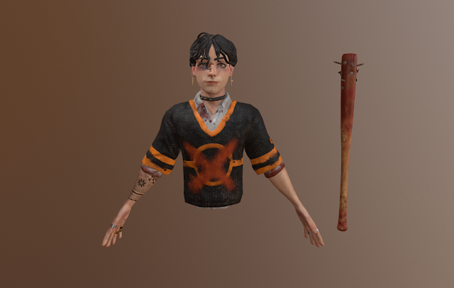
Here is my finished character along with a lit scene in unreal engine.
This project has been interesting, difficult at times but overall rather fun and has introduced me to character sculpting which I enjoyed a lot.

The sculpt of the character itself, in my opinion, is probably the most successful part of this project, applicable to the brief and I really like the design I have come up with for my character. However, it is very tailored to my own interests and aesthetics. The design didn't change too much from the initial version though I didn't end up having enough time to figure out how to create a good looking mask for my character unfortunately.
There is still a lot for me to learn with sculpting characters and this definitely shows in some areas, such as the hair which I struggled for a long time to try to get right and looking the same amount of curly as I wanted it in my design. The wrists, interestingly, were also hard for me to get right and I still think from some angles they are too thin but from others they look fine. Having this depth aspect to creating characters is new to me and I still have a lot to gain and learn from it.

Moving onto retopping of the character, though I have resulted with topology that has facial and body animation loops -  this was something that I found really difficult and it ended up being a really time consuming and tiring part of this project. I didn't struggle with the face retop but having to have to find my own resources to try to retop the body and clothing, I found it immensely difficult. In hindsight and from feedback, it would have been easier to create a very basic version of the body and then add loops to it. The way I decided to do it was through looking at retop reference and trying to approach it the same way as the face, filling it in and trying to create good animation loops.
The worst retop section is definitely the hands, overall the rest of the model doesn't have too much faulty topology, but the hands were very difficult to me and I couldn't figure them out and therefore they aren't up to scratch at all.
Another thing I have ended up with is wasteful use of topology, initially I wanted the shirt to be visible through the top but I ended up finding that this looked unappealing. So, all the topology that would have been visible now isn't and is a waste.


As for the textures of the model, I also struggled here, but mainly on the clothing more than anything else.
The skin texturing was really fun and I enjoyed putting nuances and story to the characters body. Though I do really like the face and I think its one of the strongest parts of the texturing, I do think some of the bruising and cuts don't read instantly which is a bit of a shame but I hope that to other people it looks better than what I currently see. Another one of the best parts of the texturing in my opinion is the arms and hands. This part was also really fun to texture and I think the results look realistic and to the quality I initially wanted. 
As for the clothing, there is definitely an issue here which is quite disappointing. I found it hard to get enough wear and tear without making it look really distracting, I don't think I managed to find this balance. The reason why I tried to put more damage than I would have initially thought is that last term I got heavily marked down for apparently not including enough damage into my textures where wear would be present - so I tried to amp it up. The combination of confusing feedback and not really knowing how to apply such damage to clothing has sort of resulted in a weird result.

Here is how I used the texture budget and some shots of the areas of texturing that I like the most:


After finishing the textures I moved onto skinning and rigging. Though, initially I didn't have too many issues here, I ran into a major one at the end. This was that part of the skeleton had somehow merged with my actual mesh. I don't how how I had managed this but the only way to fix is to merge the skin modifier which would include getting rid of the actual skeleton, losing any actual animation and resulting in just a pose. This is why I have been including both the initial pose and the posed character as I understand that a pose without a skeletal mesh is not as useful. I do want to make it very clear that the character was posed with proper rigging and skinning in Max, including weight painting. You can view the evidence of this in the previous post - due to time constraints I was not able to re-rig my model.
The resulting pose is not particularly exciting but I think it fits with the character and I think it looks alright in terms of awkwardness, though there's still things I could improve with the actual structure of the pose to improve on the shape language anatomical logic.

Finally, the presentation of the character in unreal. This was also tricky for me as I do struggle with presentation in unreal. I tried my best to create an interestingly lit character with a nice light rim on one side to separate the character from the background.
In some ways, I feel I achieved this and it is definitely the best I could do with unreal engine. I still feel that my character just looks so much better in marmoset and I haven't got the same sort of quality on the roughness and flatness in the lighting that portrays my textures the best and without such high contrast. For comparison I will show my character in marmoset and in unreal.
If my character looked like it did in marmoset I think I would be much more pleased with the outcome of this project as I just feel like unreal has shown a lot of faults in texturing and made my work look a lot less professional. Another reason why I just feel as though the marmoset renders look a lot better is because of the background, as recommended by my tutor I didn't leave the model in a black void but I felt as though this looked a lot better as the shadows and the light on the floor just is distracting. Marmoset has a really nice compromise here which includes a blurred background which I couldn't figure out in unreal.


'
Overall, this project has been fun yet frustrating in some places. As mentioned, I sort of feel like the final renders in unreal aren't something that I am particularly proud of and it makes me notice a lot of the issues I had with this project, the texturing specifically. However, when thinking about this project in alignment to the brief, I think there are successes and I feel as though I have met the baseline requirements, portraying a good level of sculpting, design and pbr usage. The texturing itself, technicality , workflow and portrayal in engine is of adequate quality in my opinion. 
As I have described in this evaluation, there is a lot that I could and wanted to improve on and I think a lot of this is purely down to being inexperienced in the field of 3D character creation, I know that if I were to redo this project I would be able to do it quicker and of a higher quality. I could also include some of the things I weren't able to in this project, one of those being shaders as I did not have time to look into this and apply them to my textures. 
In my unreal file, I have included the model in the default pose as this is what I would wish to be marked on, though I also have in the files the posed variant, though obviously lacking any skeleton. This part of the project was a disappointment and I really wish that this had ended up correctly though there is no harm in having practice here.
There were some positives and a lot of negatives in this evaluation, though in the end this was my first attempt at high to low poly character modelling, having to practically learn zbrush and lighting in unreal on my own - I think I have created something that has just made me want to fix my mistakes and misunderstandings and do a lot better next time.


Texturing and Marmoset

 26/02/21 - Week 21

The next step in this project was to create some textures and finally create the final renders of the blockout so I could move in to hand painting details.

I used designer for the textures which was fine as I have used it before. I had previously decided that I wanted to have my cathedral made out of bone, this was really hard to get right when texturing though in the end I had thought I had created some decent textures. I created one for the bone, one for the gold on the candle sticks and accents and then one for the walls, which was supposed to look like more of a porous bone. Looking at them before I applied it to the blockout I was happy with them and thought that it would look like a bone-like substance when applied, but this ended up not really working as well as expected.


These were the two renders I was deciding between, as you can see in them the textures became too small for them to be impactful and are just more showing a colour rather than really creating an impression of texture. After getting some feedback on this, it was pointed out that I could have some material call outs that would make it easier for me to go ahead with these textures and then show the implied texture later on.
I think I will be moving on with the bottom render, I really like the lighting I produced and it is almost the lighting I was initially thinking about, I wanted the boss to have a light around it and the other areas heavily contrasted to produce a sense of importance and god-like annotation to the boss.
Hopefully, this will be enough to begin to hand render successfully.


Saturday, 20 February 2021

Rigging + Skinning

 21/02/21 - Week 20

This week, I have mostly been working on rigging and skinning my character. Though this wasn't really easy, it was a bit more relaxing than I remember so I enjoyed having fun with this task. I did run into a few issues a long the way, one of which I am a quite disappointed about.
This is the fact that I had somehow merged a skeletal mesh head to my actual model, this meant that in the end I had to collapse my skin modifier to modify the model itself. This means all my animation is now gone, but I still have the model the way I want it posed which is a plus, I guess. I have also made some adjustments to the face using morph targets, this was a new modifier to me but I think it is really useful to preserve my original topology. 
The pose has really improved the look of my model and I am pretty happy with it, but I am a bit worried about how it will end up looking with textures. I didn't apply them whilst working in max which I quite regret, so we will just have to see once I put it into unreal.


I think due to some of my issues I will have to display both poses in my final images, but I want to emphasise here that the model did originally use rigging and skinning to create the pose.


Adding Detail to the Blockout

 20/02/21 - Week 20

This week, I worked on adding some more detail to the blockout, this was mainly guided by the sketches I did last week. After getting some feedback, I ended up just going for one of the more modular designs as it was easier to play into my initial ideas and, as mentioned, was much more detailed and interesting to look at. 

I initially created one of the designs for the smaller arches I had created and I found that though I liked it, a lot of the detail was very small and wasn't beneficial for the design so I ended up simplifying it down when I started to implement them in. 


However, I found after implimenting them I was a bit stuck with the interior design as a whole. So I ended up going back and trying to create some more designs by getting some more reference of the more central pieces of cathedrals. I ended up realising that I hadn't really though about this area even though it would be one of the focal points.


Here are my designs that I came up with, as you can see I was mainly focusing on the area towards the end. After creating these I didn't really see anything that particularly struck out to me but I did end up liking some parts of design 3, 4 and 6. This in particular was the entrance and wall design of design 3, the window in design 4 and the large pieces on the ceiling of 6. I also identified the alter in design 7 as working well.
Design 6 was difficult to me as I didn't really like the large piece hanging down as I thought it would distract from the boss if it was just below it, but I liked the pattern of the circle.
With all of this in mind I took all of these into Max and tried to piece it all together.


Looking back, I definitely should have produced a sketch of all these ideas together as in the end it was quite difficult to try to think about all of this at once. This was my finished design and finished blockout though. I am pretty happy with it and I think it encompasses all that I liked from the sketches above together to create an interesting environment. 
I still do feel that some areas are quite empty so this will be needed to sorted out at some point. Right now I think it would be a good idea to try to get some textures down and see what the piece is looking like in marmoset.


Friday, 19 February 2021

Focus on Anatomy

19/02/21 - Week 20

This week, we used a video as a method of life drawing. This definitely altered my approach to life drawing a bit and I am not too happy with the results I have produced from this exercise. I produced 3 studies, 2 40 minute and 1 that look me around 2-3 hours.
I used pencil for these studies but I do wish I instead used charcoal and chalk as I think I would have been able to produce much more movement and fluidity in my work.

One of the major things I furthered my understanding of during this exercise was definitely the muscular properties of the arms and chest area. I struggle in these areas in general so it was interesting to try to pay attention to this area of the body. The model had prominent muscles so this really allowed me to see muscles that you don't always see so well on others so this taught me some about how some of the muscle is effected when twisted and how this looks on the body.


Saying this, I still did struggle with accuracy and had some proportional issues with my finished results, I think this is noticeable in several areas of my drawings. These include the arms on the first two drawings, they are much too short now I look back on them and the chest is a bit too wide, though the model did have a wider chest than most people so it is a bit hard to figure out how much of an error I have made here. Another major issue is the sizing of the head and hands in the 3rd drawing. The sizing of the head definitely effected the hand as I would have been using the head as a referencing point for the hand in particular. Again, I think the width of the chest probably threw me off again and has perhaps provided a sort of emphasis on these issues and throws the drawing off completely in my opinion.


As for use of shading and line technique, I definitely think it is not as expressive as it could have been, as previously mentioned, perhaps experimenting with charcoal on this task would have allowed me to come up with a better expression of flow and movement into the pieces. Out of all three, the last one definitely utilises shading the best to show muscle structure and I am also happy with the shading on the material. I struggled again with accurately getting the details on most muscles and I am not too sure why this is, I think I am just not used to shading muscle in this way and I definitely need to revise this lots.

Overall, an interesting experience, I think if I were in the same room as the model it would have helped me more to understand the perspective and overcome the camera's warping.
There is lots for me to think about on the anatomical revision I need to do but I am also hoping that the next set of drawings I will do this term will help me.

Sunday, 14 February 2021

Texturing

 02-14/02/21 - Week 18 & 19

Texturing had its difficulties here and there and I don't think I am entirely done with it currently.
I was incredibly disappointed for my marks for the previous project and I seemed to get marked down a lot for not adding enough surface damage to my materials once they had been put into painter. This time, I wanted to try even harder to get a good amount of damage that is instantly readable, intricate and layered.

I achieved this mainly by creating a few of my own base materials in designer and then layering smart masks and adding specific details manually to create a unique and personalised texture. I have not yet imported my model into unreal and am currently using marmoset to view my materials on my model in a basically lit scene.
I think the method I used to create my textures ended up going quite well for me and I am happy with the majority of them. I am still currently struggling with the hair and I think I need a bit of a break from texturing to see what I should do to fix it. I also want to add some finishing touches with some alphas on the hair to add an extra level of detail.

I found the skin the easiest and most fun part of the texturing and I really enjoyed getting a roughness variation on it, though it did take me quite a while and I also struggled with getting things to the right roughness mixture so they weren't looking too wet or too dry when out of painter. My favourite part of the texture I have done is definitely the hands and arms, I think they look quite realistic and detailed.

One thing I didn't end up using which I think I should have is the use of material IDs and having more than one texture sheet open at one time in painter. I think this could have helped me tie everything together much better and not have to go back and retouch elements up in the early stages.

Overall, I still have a little bit to go before I am done with texturing, but I think a small break from it will help me realise errors and parts that aren't looking the best.

Saturday, 13 February 2021

National Portrait Gallery

 13/02/21 - Week 19

van Dyck, Sir Anthony van Dyck, 1640

Here is the original image I used for inspiration for my piece this week. I chose this piece in particular mainly down to the colour pallette and expression. I really liked the use of sublte blue all throughout the piece accompanied by the deep but soft brown. These two colours together really work well and I intially wanted to try to replicate this pallette in my own work. The expression is capturing and emphasised by the use of the lighting which is rather spotlight-y, focusing on the face and shoulder that van Dyck is looking over. The expression is of concentration but also has a lot of personality in it and almost appears like we are being drawn by the artist themselves.


To start with this piece, I used the method that I have been using in the past portraits, this includes taking a photo of my work and holding it up to the image which allows me to see my errors much easier. As you can see, the proportional and accuracy improvements here were extremely beneficial to the piece and the sketch became a lot more realistic which would be easier for me to deal with. I think I could have worked a bit further into this sketch and I think it does come of a little more stylistic than I would like and this definitely shows in the finished piece, but I think that this sketch is a rather good start.


As I got further into this piece, as mentioned, I wanted to try to get the blue-ish tint into the skin and since the hair was black on the model I felt it would be appropriate to use the blue here as a light colour. I think that in the end this was a mistake as looking at the initial inspiration and my piece, I feel that the yellowish brown against the blues is what creates the balance, so having a orange or yellow undertone in the hair would have helped this piece a lot as it became too cold quite quickly. I also decided to use pencil for this piece as though the original is not pencil, it was not the brush work that inspired me, more so the colour palette, and since I am not very accustomed to paints of any kind I thought it might be easier to use a medium that I have at least a little experience in.


As you can see at this point in the piece, I had noticed that the hair had become too cold and was standing out a lot against the warmer tone of the skin. I decided to try to add a light background to the piece to see how it would impact the colours, I used a brown much like the brown background in the original, to me, I felt as though this made the blue in the hair stand out more and it felt out of place. I was not too worried about the skin at this point and I felt I had quite nicely included some blue and warmer reds to it to create some balance. I was a bit stuck at this point, in the original image, the model had a red top and I thought that this would perhaps balance out the blue of the hair, so instead of the top being blue, the top was red instead of the hair having the warmer tint.


As you can see, this decision perhaps wasn't the best and if I were to go back and be able to change this decision I would have instead made the top a blue tone or tried to work into the hair to add a warmer tone. I would mainly do this because of the fact that this piece was supposed to be representative of the initial inspiration, but as a whole without that in mind I actually like this piece and the colour palette though perhaps a bit more abstract. I like how I have mixed the colours in this piece and I do, in the end, like the style and expression of this piece, though obviously it is a bit off brief.
I tried really hard with the shading on this piece and I think it is rather successful, I decided to use some white pen to add some small highlights to the glasses and face which helps this piece to pop and look a bit more realistic than the style of it perhaps implies.
Overall, I like this piece for the sake of the outcome but it is definitely not what I should have created this week so in that sense this piece is a bit of a failure but as I have said, it was not a waste.


VAN DYCK. A., 1640. Sir Anthony van Dyck [image] Available at: 


Friday, 12 February 2021

Working On Smaller Details

 12/02/21 - Week 19

Now I had an idea of the sort of building I was creating from both my block out and the initial sketches, I wanted to focus on some of the smaller details and create some variations to help me to explore. I mainly focused on the hallway area as this is a major part of the design and would also help me to decide design details for other areas of the cathedral. as I could refer back to these.
I am definitely going to include these into my block out when I start creating the interior, these are major assets so they will be very helpful when it comes to rendering to already have these set up.

I am pretty happy with some of the designs I have come up with though it is quite difficult for me to decide the sort of thing I want as I am a bit unsure how these designs will look in the major context of the whole hallway. I am really liking the big, deep arches in the bottom left of the lower designs as they could be a good way of playing with scale, but I am also liking the more modular effect of the the other designs as I feel this would give a greater sense of intricacy and grand-ness. 

I think the way to test these ideas out would be through modelling a couple of my favourite variations and seeing what works the best.


Saturday, 6 February 2021

Portraits in cold & warm colour palettes.

 06/02/21 - Week 18

This week, I have produced 2 portraits, 1 in a warm colour palette and 1 in a cool colour palette. For these pieces I chose to use coloured pencil. I have struggled a lot with hard or soft pastelles so I think looking for another medium to experiment with was a good idea. I do struggle with using traditional colour mediums in general as I am used to the digital experience of having the precise colour I want and not having to blend colours to get another colour.


I first attempted the cool piece. I think this is the weaker piece out of the two. As I started development, I wanted to try really hard not to experience the same mistakes as I did in the self portrait and make it overly stylised. I achieved this by taking a photo of my piece when I got stuck with it and holding it up to my reference, this made them around the same size and I was much more able to recognise stylisation or construction mistakes. As you can see I was able to produce a much more realistic and accurate sketch using this trick. Saying this, there are definitely some proportional issues still and looking at it now I can recognise the left eye is not low enough and is too high to be on the same level as the lower one. I think the sketch is still alright and at the time I was quite happy with it.

As I progressed with the piece I was finding it quite difficult to add colour to the lighter parts to the piece without other saturating it, I wanted to have the cold feeling of the piece stand out quite a lot but I think looking back it may have been beneficial to start with a base layer of blue and then erase where I needed to. At this point in time I was only really using blues but I had began to place down some purple in the areas that would be more red. I think this was a good idea and I think it adds the touch of warmth for the piece to feel a little bit more alive.

As I came towards the end of this piece, I added in the shoulder and i think this was a really good idea compositionally. The block of shadow that I placed in early was a mistake in my opinion, I don't like the harsh ending it gives to that side of the piece and I much prefer the gradual reduction of colour that the shoulder produces.
I struggled quite a bit with the hair in this stage, I had gone for a strand effect and not really a block of colour that this piece probably called for. I originally planned for the strands to become a bit less stylised but I found it hard to create a very dark area with the coloured pencil and it has caused the strands to stand out much more than I originally wanted.
At this point in the piece I had also stared to add some green in, I do like this and I think it creates a nice gradient in the colour palette whilst also emphasising the purples in the piece and adding some interest into the shadow.
I feel that the overall coldness of the piece is definitely conveyed but I am not sure about the emotion and mood, I feel like a lot of the dynamic of the original reference has been removed as I completed this drawing. I am not sure as to why this has happened but I really struggled to get the mouth the right shape and I think this removed a lot of the emotion and replaced it with a blank expression.


The warmer piece I feel was much more successful in some areas. I went with the same method for the sketch that I did in the first piece and as you can see my initial sketch wasn't accurate at all, I then slowly managed to pull it together by just using the trick I did in the previous piece. I still struggled a bit with this sketch in the end but I eventually settled with something that I felt ok with, as I experienced in the previous piece that when the coloured pencil comes in you can quite easily adjust the sketch and adding shading in general can help shape the areas I wasn't completely happy with. I chose not to include any of the drapery in this piece since I wanted the main focus to be on the face and I also liked the idea of recreating the fade of colour in the cool piece.


As I added some colour down I was much happier with the piece. I again can see that in the end I had created some inaccuracies at this point in the drawing. The eyes are much bigger than in the reference and there is some stylisation that I wanted to avoid that had become apparent. I was having a lot more fun with the colour palette in this piece as I was able to use some browns and skin tones. I used this to try to get rid of the amount of white that was showing before. I still think it is apparent but it looks much more complete this way and also distinguishable from the background.


I finished thus piece up with the hair and the fact that the hair was lighter in the reference it makes more sense for the hair to be a lot more strand-like and more as blocky so this style works a lot better here. I really like the effect the purple creates as shadow. I did again struggle with creating very dark areas and I think the darker parts of the hair could be put more into shadow to add more realism to the hair.
I captured the expression in this piece much better and I feel that it compliments the colour palette well. I think theres still some ways I could have captured a warmer expression though, as this one could again be seen as a little bit blank. I really like to capture slight emotion in blankness as I think it can be very telling but it is quite hit or miss as sometimes you can't tell the emotion at all. The expression in this piece could be hard to tell for some people which is probably not the best result.


Overall, I had fun creating these pieces and using coloured pencil was really interesting considering I haven't used it for many years. The similarity to just using a regular pencil allowed me to have lots 
more control than I have with other colour mediums I have used. I don't think I could have produced an accurate or detailed piece with any other medium apart from coloured pencil. I have picked up quite a few skills so hopefully I can implement this into my next piece.