Friday, 30 April 2021

Finished Boss Monster

 30/04/21 - Week 30


I have now finished my boss monster alongside my arena. I finished this piece off by adding some blood dripping from the dress and wings to help with the boss feeling and also a call out of the face as well as a scale factor for more context. I ended up deciding that I didn't want to add anything more as thinking about the subject of my boss, the fact that it is a fallen angel/Satan like depiction can easily play into a more normal angelic figure as lots of pre-existing depictions of those two beings are angelic in nature.

 I think there are a lot of similarities in the process that went wrong between the boss arena and the boss itself. The main one is definitely not sticking to my original idea and eventually coming up with something different where the idea is not as strong but still produces a mediocre result. However, I am not sure if perhaps this was needed since the level itself was not what I thought so having the angel as a bone or organic structure would not necessarily make sense with the context of this in the cathedral not being apparent. Instead, I have come up with something that is not particularly unique but with the arena in mind I think it works to some extent.
I did try to give this piece nice rendering and have the level of detail that I wanted and I do think that this has worked but in terms of detail, the final design has really let this down, I feel like there are some large areas where work needs doing such as the wings, sword and dress as there isn't enough ornate detailing. This is definitely a design process issue, I am not very well adjusted to adding detail at the final stage and this piece definitely shows that as it needs that extra level of tertiary detail to really make it anything special.

As for the positives of this piece, as mentioned, I do like the overall render of the piece and I think for my own skills this piece lives up to them. I am especially proud of the rendering on the sword as I am not used to this kind of material and I think the rendering looks alright, though obviously can always be improved. The finished design though is very mediocre to me and I am not a fan of that, but these are my design limits I feel as sometimes I do lack the creativity to get to a high level of design, so overall I am somewhat happy with my final creation.

Overall, I am definitely happier with the arena rather than the boss itself as I can see lots of room for improvement and looking back, a lot of time where I could have improved it and tried to push myself a little more.


Sunday, 25 April 2021

National Museum of the USAF

 25/04/21 - Week 29

This week, we had a virtual tour of the National Museum of the USAF. This was a rather interesting tour and I surprised with how interesting I found some of the planes. I started off by creating 4 different sketches. I think these turned out very sketchy and I didn't try too hard with these because I wanted to focus my efforts onto the final piece more. I was originally going to do a different plane for the final piece but I liked the results of one of the sketches more.


I wanted to make sure the sketch was a bit more prepared than the last vehicle sketch and I think I succeed a bit more in this sense since the plane looks more proportionally correct and follows the correct perspective. I also tried to make the lines a lot straighter and more true to angle so I didn't have to fix this later.


As I started to add some shading into this piece, it was looking a lot better than the vehicle piece already. I think some of this is down to the already interesting lighting which had a lot of contrast and really helped to add clear defined features to the piece, I was also a lot slower with the application of shading and adding detail because I wanted things to look less thrown together and this definitely showed.


I also went in a bit earlier with the charcoal as I thought this added much needed contrast to the vehicle piece, it again worked well here and it did add much needed darker value to the piece. There is still a lot to improve here and I think using even more time to get my lines straighter and more well defined would have helped boost this piece up to the next level. 
I also do notice some perspective and shape issues mainly on the rounded pieces, I found them quite difficult to get the right shading in general here and I think this was because I didn't notice issues in the piece from the start.


Overall, I think this piece has turned out much better than the previous vehicle piece as the shading is much more realistic. The combination of the smaller details and the good level of contrast helped this piece a lot too but the aforementioned issues don't allow this piece to come together in my opinion.

Friday, 23 April 2021

Finished Boss Arena

 23/04/21 - Week 29


Now I have worked some more on the boss monster, I have finally finished the Boss Arena.
This was mainly completed by adding the carpet and some blood on the altar as this is included in the boss' design. For the final image I have also added some decoration to the piece, material callouts and some text/annotations for some description, there is a version without the annotation on the level itself included on the PowerPoint.

The successes of this piece are mainly in the overall structure and basic concept, in my opinion. I think there are a lot of successes in the shape of the arena and it has the grandness that I wanted from it - mainly from the scale and the detail in some of the areas. I also really think the piece benefited from the red carpet as it filled a lot of empty space and also a pop of colour that I was initially unaware the piece needed.
The way the arena was constructed was a new method to me but I think the fact that this piece has only few perspective errors means that it instantly makes it look a lot more professional. I will definitely use this method more when creating scenes like this as the process was sped up quite a lot. Though this took me a while as a whole, the rendering process wasn't too slow and I think I was able to add a lot of depth and drama to the scene easily without having to worry about my perspective being off.

The lowest point of this piece is definitely the rendering of the materials, however. Though I have included some material callouts, I struggled lots to full realise the materials that I wanted from the piece, especially the bone. As a whole this piece lacks the inspiration from the initial concept and I would have loved for it to have a better resemblance to the thoughts I was having at the beginning. Even though I like the details I have included in the arena, I think having more obvious bone structure and bone accents would have put the arena up a level as it would be much more unique, boss-level light and nuanced. Noticing the fact that the arena as a whole was not looking as I initially wanted I essentially gave up at one point in trying to properly render the bone how I wanted it to, this was definitely a mistake and if I were to go back and redo this piece I would probably change a lot of the interior design and try to make my substance designer materials more accurate to the plan.

There was a lot of time in this project where I was thinking about starting over to get the initial idea back, but in the end I am somewhat glad I didn't. I think the idea is definitely different and perhaps not as successful as it could have been in comparison, but I still think this piece has some good aspects to it and most importantly has drama and looking at it now, I think it does have the eligibility to be a boss level.
Overall, there is a lot of positives and negatives in this piece but I think I am overall proud of it unlike some other projects I have completed during my time on the course.


Thursday, 22 April 2021

Final Piece Development

 22/04/21 - Week 29


To start, I took my chosen colour and started to add some layers of shadow and highlights to result with this. This is how I usually render human figures so this was not too challenging for me. I then collapsed all the layers and began to render out the shading. I went for a strong back light as I felt it was a bit more descriptive of the lighting of the arena itself - I also made the lighting a warm yellow/orange to also imitate the arena lighting. I think this lighting is pretty impactful and I am pleased with the way it turned out in the end.


As I got more into rendering, I slightly changed some of the features such as the chestplate and the bottom of the dress as I felt it wasnt working as well as it could, but these features definitely helped to add some more detail. Here, a lot of the lighting has been rendered out significantly and the piece was starting to look much more like I wanted it to. However, I did slightly struggle with some of the rendering such as the sword and red jewels, I don't render this type of material much but I feel that I eventually got to a good place with the lighting and texture by increasing the contrast and adding some more accurate highlights. I also struggled somewhat with the metallic objects but these just take a little more time for me to figure out as they are more reflective.


As I came to close off the front view, doing so by increasing a lot of contrast in quite a few areas such as the wings to create a more dramatic look and improving the texturing on the sword again to make it look as good as I could make it, I moved on to the back view. I didn't have too much of a plan for this area but I decided I wanted to place some gold detailing onto the back, I ended up going with a cross as I felt that this had some contextual connotations. I decided not to also include the sword and scales since I felt they were accurately described in the front quarter view already, so to save some time I just went with the main body. At this point I was starting to notice that the boss wasn't exactly how I imagined and I became concerned that the boss wasn't "evil" enough and was a bit inconspicuous which wasn't really what I wanted.


After adding some more detail to the back, I was still thinking about the previous comments and have started to consider some options on how to approach adding some quick and convenient details to make the boss look a bit more evil looking. I want something that isn't too hard to work into the piece since I have already almost finished it. I think a good way to do this would perhaps be to adjust the wing shape or add something to the face that is a bit more menacing, I am currently thinking that a mouth of some sort of lots of eyes could be the way to go. I don't, however, want it to look out of place or over the top as the face being blank adds some amount of mystery that I want to keep. I will think on this more and do some tests then eventually finish this piece soon.


Sunday, 18 April 2021

Base Materials

 18/04/21 - Week 28

I mainly focused on creating the main base materials this week. I chose to only create some of the main more unique textures I would be using in designer as I felt the stylised aspect would be easier to achieve than realistic is in painter.
I did some research on each material I was creating, mainly looking at stylised games such as overwatch to try to mimic some of the stylistic elements they have in their materials. One of the main things I noticed was the lack of microdetail, which isn't what I am used to, and the more rounded and enlarged details to create some variation. Here in my plaster I have done this by making some varied circular indents into the plaster to make it look worn down, but as you can see it is not too in your face though still descriptive. This is exactly what I wanted and this material in particular is probably my favourite. The plaster will mainly be used on the walls.

This is also the approach I took with the chipped paint, though a little more worn and including the pattern chipped paint makes to show what it is. I plan for this material to be used on the cupboard doors in the kitchen.


I then moved on to the stone textures, still taking into account the previous research I had done. In research for the floor tiles for the kitchen, I found a way of adding some dirt by using a node called height blend. The tutorial was using this as a stylised dirt for outside tiles, but since I want my area to be inside and also have some grass growth between the cracks, I decided to add a more grimy-plant like green tint to it which I think works quite well though I think it will end up looking better in context.


I also used this method previously mentioned to create the same sort of effect on the stone bricks, I will be using this texture for the floor in the armour room and I think also the large window arch. I made this one a more leafy shape which I really like, it definitely plays into the cartoonish feel I am creating here with the shape of the cracks and chips in the bricks and tiles - these created by slope blur which is also a new method that really helped me here.


Now I have completed these I can go on to start texturing in substance painter a long with my other designer textures too. I am a quite bit behind with my schedule as I wanted to be almost done with texturing at this point and I feel like I haven't even really started. After that I still have my foliage and particle effects to finish too, so still a lot to go but hopefully I should be able to get this done.


Wednesday, 14 April 2021

Final Design + Colour

 14/04/21 - Week 28

I started off this week with creating my final design. I did end up mixing a lot of things from the previous designs I came up with and I am quite happy with the outcome. After mixing all these elements though, I found that it wasn't reading as well as I had initially thought so I took the silhouette and fixed it to read better and then retroactively changed the design to fit the silhouette which made it look a lot cleaner and intentional. I also added some values to the piece to help with the read and also to prepare for adding colour which I then moved on to.
I started experimenting with colours and then got some feedback on what was working well. After getting this feedback some were saying that they liked the style of some of them but they wanted the colour of the sword changed to the red. I came up with the last two designs and I think that I am going to chose the very last one at the bottom as I like the lighter colour on the wings and the use of the silver in the scales to match them.


Sunday, 11 April 2021

Collision and Lighting

11/04/21 - Week 27

This week, I have completed my collision and also started on my lighting to get a basic idea of what I want in engine.


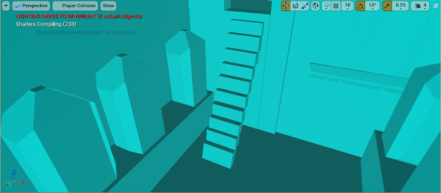
I have not done collision before so this was a good experience for me, I did end up using a few of the auto generated collision but most of it is my own which I have just created using the suggested method of making basic boxes in max that are the general shape of the mesh and exporting them as a UCX. 
As you can see I have attempted to make the ladder work by using a sort of thin stair approach, this is obviously not a realistic way of climbing up and down ladders but I am hoping that the tutors will allow this as I really like the use of the ladder in this area and I would be a bit disappointed if I had to let it go. It does function for the most part anyway.


Here is my current lighting let up, as you can see it's very rough right now but this is generally what I want, having the main window be the main light source then having some assisting lights from the lights from the ceiling. I think this will really bring focus into the kitchen and if I can create some kind of misty effect here it will also make it look very pretty and inviting - the serene feeling we initially wanted. I think looking at these screenshots, I want to make the lights a warmer tone to blend with the warmth from the window light.

Now I have gotten everything in engine and created some collision I definitely feel like things have fallen into place a bit more and I am now ready to get on with creating some base textures.


Thursday, 8 April 2021

Variations 2

 08/04/21 - Week 27


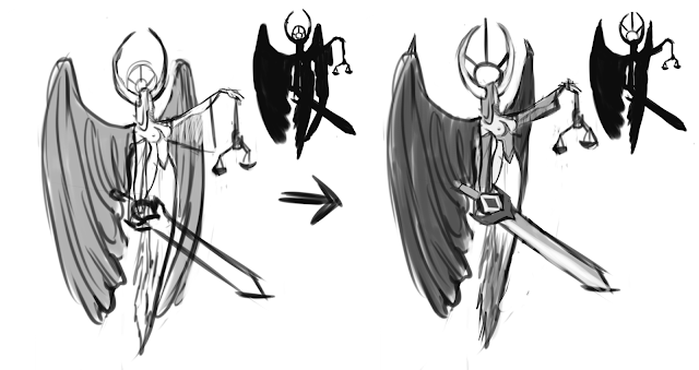
Taking my favourite sketches from before, I wanted to draw a few of them up with more detail as I was unsure of where I wanted to take what I had already came up with. I also wanted to add some weapons as revisting my moodbaords I noticed that quite a few of the bible accurate angels and also the artworks had weapons included in them and it added quite a lot of connotation to the piece. I chose to add a different weapon to each one and I have ended up liking both the weapon in 2 and 3, I initially saw the sword included in the bible accurate angel pieces and I thought that it was impactful and added a nice centre piece. The scales were something I thought of on my own as I thought that it was a nice tie in to the reckoning side of thing, indicating the boss could determine things with the scales perhaps.

Overall, I really like a few things from each of the designs here so I think I want to tie everything together for a final design and then get on with choosing colour and rendering.


Sunday, 4 April 2021

Creating High Poly Models

 04/04/21 - Week 26

This week, I mainly focused on getting my high poly for the models that needed it done. This was the first time I have properly sculpted some hard surface and it was rather difficult to get it looking right though my more natural forms ended up looking alright.


I first started with a quite important aspect of the scene, this being the stone arches that I want to use for the door ways along the hallway. This was a little out of my comfort zone as I haven't sculpted rocks before but looking at some stylised stone arch references really helped me to get the style I wanted across. One of the hardest things was trying to make the middle sections as crisp as I wanted them and I perhaps could have benefited from having these as separate objects/groups but having just returned to zbrush I didn't think of this and just got straight into sculpting instead of planning more.


The next thing I tackled was another important part of the scene and could perhaps be the called the centre piece. This was the large branch. I again used a low poly to start me off here as I'd created the basic shape and size that I wanted it otherwise I don't think I would have been able to predict how it would look in the scene. Again, I should have used groups for the branches, but overall this wasn't too difficult to sculpt as natural shapes in zbrush are definitely a lot easier as smaller discrepancies blend in.


This was the most difficult thing I created, I did use different objects and groups here thankfully, but sculpting this to make it look smooth and like a crafted item was particularly difficult. I used my references from the mood board to come up with the design for this helmet and in the end I think I really like the product but the lack of smoothness and thickness continuity really shows up and is distracting. I would like to work on this further but I feel as though I need to speed up so I am going to leave it where it is for now. 


I also created a high poly for my frame, I did this in max using a method I found online. It mainly includes using the cut tool on a plane by placing the reference behind it, you then make this 3d and turbosmooth. This method was super useful and taught me a lot about the uses of turbosmooth and control loops to make the edges smooth in a desirable way. I am happy with the results I have here.

Overall, I think I am happy with the high poly I have created though I may need to touch up a few things to get some crisper edges and better looking hard surface if I get enough time.

Thursday, 1 April 2021

Variations 1

 01/04/21 - Week 26


From my thumbnails, I took my most favourable one and started to work into a bit more. In these I also added some details that were on other thumbnails that I liked.
I found this process quite nice in the end. I took into account the method I had used with the thumbnail sketches where I would not change too much in the end this can make it really hard for me to come up with ideas. This time I focused more on parts I actually wanted to change or work on instead of the piece of a whole and I found it much easier to come up with results.
 I am quite pleased with them but I also feel like I still have this mindset and there could have been more variations/better results if I had tried to only change one or two things. I will definitely keep this in mind for the next time I do this sort of work.

In the end I really like the results of thumbnail 3 though some aspects of 6 and 5 are also really appealing to me so I'm not too sure which direction to take the design in currently.