Sunday, 31 January 2021

Retopping

31/01/21 - Week 17

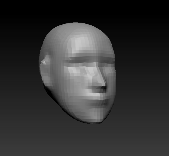
My first retopology attempt
My second retopology attempt


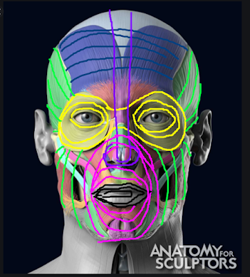
This week I have been working on my retopology. I wasn't really aware of how time consuming and difficult this would be. I did look at reference for how my character should look but it was very hard to replicate it for me. I constantly got confused with the body topology, since the face topology we had been given a tutorial for it wasn't an issue, but the body seemed to be a confusing mess of different loops that intertwined and getting a single one incorrect would throw the whole thing off from my reference. I also found the hands a real difficulty and though I have to be finished with the retop now due to the time constraints, I am still not happy with them the most.
Another thing I was struggling with was the fact we had to make it a higher topology than last year, I was confused as to where to put the new loops and ended up using a open subdiv to add more to the hands and face. I still don't think this was my best option and to improve I should have tried to spend more time on the hands especially, though finding this time was quite hard.


As for the rest of the items on the body, most of it was easier to cope with but the clothes did provide some issues. I was struggling with the conform tool due to some of the awkwardness of the clothing I created, I think I have made things a lot harder for myself in some places and I think having tighter clothes would have been much more beneficial to me.


I think by the end of this process I understand how to create the low topology for my character, this was just an incredibly time consuming and difficult process to try to figure out on my own.

Saturday, 30 January 2021

Thumbnails + Sketches

 30/01/21 - Week 17

To get a start with this project, I wanted to start with some thumbnails that included the boss as I felt that this would give me a bit more of an idea of the environment and main area of the level itself. I ended up being really set on the cathedral idea, and also in getting some feedback the idea of the cathedral being made out of another material like bone or muscle really interested me and I want to try to incorporate this.
I did try to create a sketch of this but I found it quite hard to draw what I had in my head in this situation, the pillars in the cathedral will definitely have to be something that I work further into and try to come up with some more designs. 
From my designs I liked the 6th one the most as it allows for a sense of grandness. I thought a bit more into the floor plan and the 2nd thumbnail could be the main area for the boss whereas the other is the hall leading up to it. I fleshed out these ideas a little better. This is my main idea for now but I also have some other ideas from the other thumbnails which could have the boss appear from a hole in the ground or just roams the cathedral instead of being chained up. 


Friday, 29 January 2021

Facial Loops

 29/01/21 - Week 17

This week we have been going over retopping and an important part of this is creating correct facial loops. One of the main reasons that correct facial loops are needed is for animation which requires accurate expression so we can relate to and identify character emotion.
Widely accepted face loops mimic the muscles on the face to create accurate movement, you can see this by comparing these images below. A major example of this loop placement is the muscle around the eye, the orbicularis oculi, this muscle is responsible for eyelid movement and partially the eyebrows. The eyelids and eyebrows are two very telling parts of the face and most emotion can be told from these areas of the face, making this the most important muscle to mimic in topology. If this part was off it would be much harder to create realistic and instantly identifiable emotion.


This muscle is very easily identifiable as they look very similar in the topology and the muscle itself but all other loops in the face are still a rough recreation of how the face uses muscle to move. 
Obviously, perhaps an equally important part of the face to correctly mimic is the lips and mouth area. Without this correctly stretching and moving, it would make creating any mouth movement very difficult. Smiling and frowning are another instantly recognisable way of telling emotion so a lot of focus needs to be put here. The mouth can create quite extreme folds and distortion as well so a higher density of loops needs to be apparent here for support.
Most other areas of the face will not move in an extreme way so the use of looping around these two high priority areas provide extra assistance to allow for as little distortion as possible whilst still having similarity to the muscles on the face to increase realism and easy animation. You can see the way you can recognise this below:


Thursday, 28 January 2021

Renaissance and the Golden Dutch Age

 Week 17 - 28/01/21

Vermeer, The Milkmaid, 1658-1660

Johannes Vermeer, a Dutch 17th century painter, was a very notable painter from the Golden Dutch Age of portraiture. He is well known for his few, but masterfully created, middle class interior scenes that mainly feature women. The most well known examples of his work include Girl with a Pearl Earring and The Milkmaid, the latter being the painting I have chosen to study today.

The Milkmaid, painted around 1658-1660, is an oil painting depicting maid peacefully pouring milk from a jug into a bowl with surrounding items on the table. The scene also includes a basket on the wall, foot warmer on the floor and small image of Cupid on the tiling next to it.
It is well thought that the inclusion of Cupid and the subject of the maid herself - socially thought to have a lustful attitude during the time period - create a theme of arousal and intimacy in this piece. The maid appears tranquil and attentive of her actions. The stillness in the piece is resonated throughout the whole image with the only moving things being the milk and the maid, who seems slow and quiet.

Compositionally, this piece is made up by a triangle and a diagonal, the triangle flowing upwards and pointing into the middle where the maid's face is. The foot warmer and basket then plays into the secondary focal point, that being the milk jug itself, you can draw a rough line through these and see that the jug lies in around the middle ground. This line is further emphasised by the angle of the apron, corner of the table and the positioning of the hands.


The composition of this piece is also backed by the lighting, this again helps the diagonal line with the shadow from the basket, but also a beam of light focuses on the table and maid's body in the midst of the shadow from the opposing wall.

One of the most striking things about this piece is perhaps the colour scheme, the use of the saturated blue and pale yellows supported by some deep orange/reds is very carefully used and expertly separated to a suitable amount. These saturated colours contrast the pale wall around the main features which allows them to stand out but also provides another step of realism in this piece. It is mentioned that getting the realism in these white walls was difficult for artists at the time, so the realistic light reflectivity and nuances in the texture is extremely impressive and controlled by Vermeer. The cleanliness of the white creates a cool tone on the piece, emphasised by the cold, bright white on the window and obvious nature of the blue. It creates a subtle yet effective clean and sparkling effect on the piece which connotates water, relating back to the still, tranquil nature of the piece in general.

VERMEER, J., 1658-1660. The Milkmaid [image] Available at: 


Sunday, 24 January 2021

Sculpting the Clothing

 24/01/21 - Week 16


As it turns out, the hair was not the most difficult part of the sculpt. The clothing definitely was the hardest thing I have done in zbrush. I was really trying to understand zmodeler but it was really difficult to me and i was not sure why. In the end I managed to understand it through certain tutorials that only really used one part of zmodeler that appeared to do the majority of the work. I managed to create the clothing by instead of extruding, duplicating the model and then making the part I had masked out much lower poly. Since the topology on the model was better it allowed the topology on the clothing when put to a lower poly count to be much better and not mess and look awful.
The collar on the shirt was definitely the most difficult to create but since I understood zmodeler a bit I was able to pull out some polys and create the shape I wanted. I did still struggle with trying to push the polys into the right place without everything clipping into itself but in the end I got there. I then used dynamic subdiv to make the whole thing nice and smooth, this tool was really important in clothing and I didn't know about it before so overall, a very good (and very annoying) learning experience.


From there onwards it was just a case of sculpting in the folds which was super fun. I really like the look I created here and I think the folds look realistic enough. I didn't really run into any issues here, I just needed to make sure the folds looked right but this was all down to finding good references.


I did have a couple problems with the oversized top since it was super hard to find reference of this type of material I was going for and having the shirt underneath would also change the dynamic of the folding. In the end I think I was able to make the clothing look as I wanted it to but I still feel it looks a little too thick. I am hoping that once I am able to texture this it will read a lot better.


I have now finished the main scuplt to a point where I am happy, I will now have to begin to retop. For my first ever full sculpt I am really pleased with it. I think having a background in drawing people really helped me to sculpt what I wanted and I didn't realise the skill would be so transferable to sculpting. This whole process has been a massive learning experience and I still feel I have only just touched the surface of zbrush, ideally we would have had a little more time and help to figure out this program since everything about it is just odd to me. 


Saturday, 23 January 2021

Human Head Construction

 23/01/21 - Week 16

This week I have produced a drawing of a skull. I think I am pretty happy with this piece since I think it is rather accurate. I mostly produced this accuracy from the original sketch which I spent a bit more time on than usual, I wanted to spend a bit more time on construction this week since getting into the shading too quickly in previous weeks has put the final result of my work down. I started to get the main shape of the skull in by using lots of straight lines to get an idea of the curve I wanted to make, I liked this method a lot and I want to incorporate it more.
There is one major issue with this piece though it can only be seen when places up to reference, this is the difference in size of the jaw. If you are not given the reference then, to me, you cannot see how misjudged the size is. But it has made the skull a lot more masculine. This was really an issue with measurement and I think using a screen to work throws off my measurements sometimes. I obviously got the width to height ratio wrong here, but overall I don't think it takes too much away from the final piece.


As I started to get some of the main shading in this piece really came to life and at this stage I was still happy with it. I did struggle a bit with some of the placements of the bone but watching the video provided helped me understand the way the bone structure exists. I also looked at a lot of reference to try to further my understanding of the depth in the skull. This helped me in some areas but I did find trying to get the depth on the eye socket quite difficult and the addition of the screws and splits in the skull didn't help this.


To complete this piece, it was mostly a case of deepening the shading in some areas and then lightening it with my putty rubber. I am very happy with the outcome of this piece and I think adding the background really helped to bring out the skull as a whole. I am not sure about the addition of the plinth but I wanted to get the drop shadow into the piece which I felt would further enhance the shape and authenticity of the skull. I think it does help but I am not sure it effects it enough to be worth the addition. In these final stages of the piece I found it difficult to decide on the sort of texture I want, bone isnt completely smooth but it can appear as so. I am still not sure whether it would be beneficial to make the lines a lot smoother or leave them to add texture and interest. My favourite area on this piece is definitely the teeth as I think I did well to bring them out of the page by paying attention to the gaps and the contrast in that area. Overall, I am proud of this piece and I want to take the methods I used to other pieces.

Friday, 22 January 2021

Sculpting the Hair

 22/01/21 - Week 16


Sculpting the hair has been the trickiest part of the sculpt so far. I think I have redone the hair about 3 or 4 times now. I was firstly struggling with the texture I wanted to make. In my concept he has curly hair that is quite bouncy but obviously it would take me too long to create every strand by hand. If the hair was straight I may of considered that but since curly hair needs to be more unique in each strand I decided to model it as one with a few strands at the front. The texture was still a problem doing it this way since I couldn't quite get the effect I wanted. After doing the sculpt above I just felt that it looked like a brain or something of the sort, not really hair like. This was a bit disappointing since it took me a while to do the whole head since hair needs no symmetry. 


After trying a few more times I ended up using the inflate tool to try to push out some of the strands and make them look a bit smoother, this created a really nice effect and I started to use it a bit more and then cut into it to create the look of curly hair, the result looks way cleaner and more hair-like.
The next issue I ran into was the strands. The topology was getting way too messy and was getting too thin or just didn't look right. I solved this by starting over with the strands and trying to get the best topology all the way through the movement of them. I also used the polish and inflate tools to make the parts thicker and smoother when I needed them to be.

I am much happier with the hair now and I am also beginning to learn a bit more about how to topologize better in zbrush which is really useful and will definitely help me with the clothing, I am still a bit stuck on zmodeler but I will be using it lots with clothing so hopefully I will figure it out.

Thursday, 21 January 2021

Sculpting the body

 20-21/01/21 - Week 16

Sculpting the body was not too much different from the face, I again started with a low poly sphere and pulled things out where I wanted them to be. It was a little tougher to get the look of the body right as I am more used to drawing faces so that part was much easier. I ended up finding lots of reference and other people's sculpts to determine placement of muscles and the look of different areas of the body. 


The hardest thing to create was probably the hands, though I stuck to my methods and I think I managed to sculpt something recognisable as a hand and overall I am pretty happy with them. I think there's still some detail missing such as in the base of the hand itself and I plan to add that detail once I attach the hand since a lot of the look of the hand makes more sense to me in context of the arm. I chose to make the palm and thumb one object then sculpt an individual finger and copy it over.


Here is where I am currently at with the sculpt on the body. Obviously I still need to attach the hands but then I will be pretty confident to move on to clothes and hair. So far I am pretty happy with the outcome of my sculpt and for a first proper attempt at sculpting I think I am quite proud of it. I also think I am on the right path right now, though I also need to do some research on retopology and having cleaner topology in zbrush in general as this is definitely where my knowledge lacks.

Monday, 18 January 2021

Finishing off the Face

 18/01/21 - Week 16


I have now gotten the face to a place where I am happy with. To finish some things off and get an idea of placement I have sculpted some eyebrows and also a small lash line to add a bit of depth, I am not sure if I will include the lashes in the high poly but I think it creates a nice small detail to the face. I have noticed that as this sculpt has progressed it has not become as realistic as I wanted it to be, but I do like the style I have come up with. I have still been struggling a bit with the likeness of the model but I think that it's probably best that they don't look completely similar, and I am also happy with the look of the face in general.

 I am really glad I chose the method I did to create this sculpt as I feel I have created a smooth sculpt with things in the right place and in the right proportions. I have not run into too many issues but right now I am just trying to figure out how to use zmodeler so I can create better topology easier. I wanted to use it for the brows and lashes but have found it too difficult. This will be important for the clothes so I will try to use it more as I move into the body.

Sunday, 17 January 2021

The British Museum

 17/01/21 - Week 15


This week we were tasked with drawing a piece from the British Museum, I found a piece of pottery that interested me because of the featured figures. This was quite a fun piece to draw and I am glad I picked it.
To start, I think I had a really nice base that had a good amount of accuracy, I struggled a bit to convey the curve of the pot with the skewing of the figures here. I definitely could have been a bit more precise in some areas, just to get the handles and base correct, but overall I think I was off to a good start.


Whilst adding a first pass of shading, I began to realise that the gradient on the pot was going to be a lot harder to create than I thought but I do like the way I used line here to convey the curves of the pot, I think this really helped me shading-wise. A dark object is always a challenge for me.
Another thing I was begging to struggle with was the faces of the figures, I found it difficult to copy the style from the original as I have never drawn a face in this style before. I tried to keep things simple on the face for the moment as I was thinking that it would be formed of very intricate shading rather than more noticeable marks.


The decision to do this really helped me in the next stage as I was able to create a more accurate portrayal of the face by trying to keep it more minimal.
I tried to create the shadow that I could see from the photo though looking back on it, I feel this was the wrong decision as it confuses the lighting quite a lot. The lighting as a whole was quite difficult as having lighting from both sides was causing everything to look very flat which was not what I wanted. 


To me, the finished product does still have that flatness that I was trying to avoid, this could have perhaps been solved by increasing the contrast of the piece, but I felt it was quite difficult to do when I already had a highly contrasted piece. I wanted to figures to stand out as they do in the original but this made it very difficult to add detail without things becoming too dark and muddy.
Overall, this piece was quite challenging but I did enjoy the challenge of it, though the sucess of the final outcome is arguable.


Saturday, 16 January 2021

Moodboards

 16/01/21 - Week 15

This week I mainly wanted to focus on gathering some references for the start of this project. I had to think quite a bit about the sort of boss/level I wanted but I ended up being quite set on some sort of large angel. I am still undecided on the level itself but I want either a heaven-like arena or a cathedral, basically something that is common imagery from Christianity.


A lot of my references came from dark souls as the games have a lot of this type of imagery and uses gothic architecture which is very common in cathedrals. It also has several types of angels which are rather interesting and was good inspiration.
Thinking more about the boss itself, I was also thinking that the angel could be a bible accurate one, which are mainly made up of shapes or are actually much more frightening than a classic looking angel. This would be something super interesting to look into but is perhaps harder to place in a boss level.


Friday, 15 January 2021

Begging the Sculpt

 15/01/21 - Week 15


Now that I have created my design, I wanted to get on and try some sculpting. I have been practicing a few sculpts using a few different methods I have been researching on youtube. The one that made the most sense to me and gave me the best outcome was starting very low poly and very slowly adding more detail by dynameshing at the point where I couldn't make add any more detail to the current model. I preferred this over using the blockout method as I found the result was way too cartoonish and not the style I was going for, also it used a much more high poly approach which made it much harder to smooth things out when adding detail. 


This sculpt and the 3 practice ones have been my first attempt at using zbrush as I chose not to use it last term. It's a tricky program to understand and I have been doing lots of research to try and get my understanding to that of basic. Now I have the basics down I should hopefully be able to create a good looking sculpt.


This is where I am at currently with my sculpt along with a photo of my reference, I also have reference of the same model from different angles. This is my first time sculpting with a reference as in my practice runs I was just messing around. Having a reference for facial structure is definitely really helpful and though I am struggling a bit with the likeness hopefully once I add more detail I will be able to pull it together as right now it's still very basic.

Wednesday, 13 January 2021

Designing the Character

 13/01/21 - Week 15


To start off our character bust sculpt project, I have designed a character. I tried to make him simplistic yet has at least a few different materials that will allow me to practice sculpting and texturing. I am quite happy with the design though I am a bit worried about how closely it follows to the brief, something I found quite difficult whilst designing my character was really getting a clear idea of what a bounty hunter is, since someone considered one can look very different and be used for lots of different things. I have also included a back view in my design just to make some things a bit clearer for me.

I have gathered some references for my design that describe the material which has really helped me to both visualise my design and also consider the types of materials I would need to create. I think the most difficult will be the material for the sports top considering I want this to have transparency where the material is made up of small holes. As for some condition of the clothing and other materials, I want it to be visually worn and ages but I don't want there to be any major damage, so this will mostly consist of me working out how and where to place the worn/scratched and dirt effects.

I want to approach this with a semi-realistic, leaning further towards realism style. This is a style I use in my own drawn work, and I want to see how I can integrate this into 3D. Obviously the sketch here is stylised but using lots of references will help me to produce a much more realistic outcome but with my own flair.